ART BASEL, 2018
THE BRIEF
Saab Art Projects was asked to participate in the week-long Art Basel exhibition in Switzerland. In preparation, the company decided to make a commemorative book for guests and collectors.
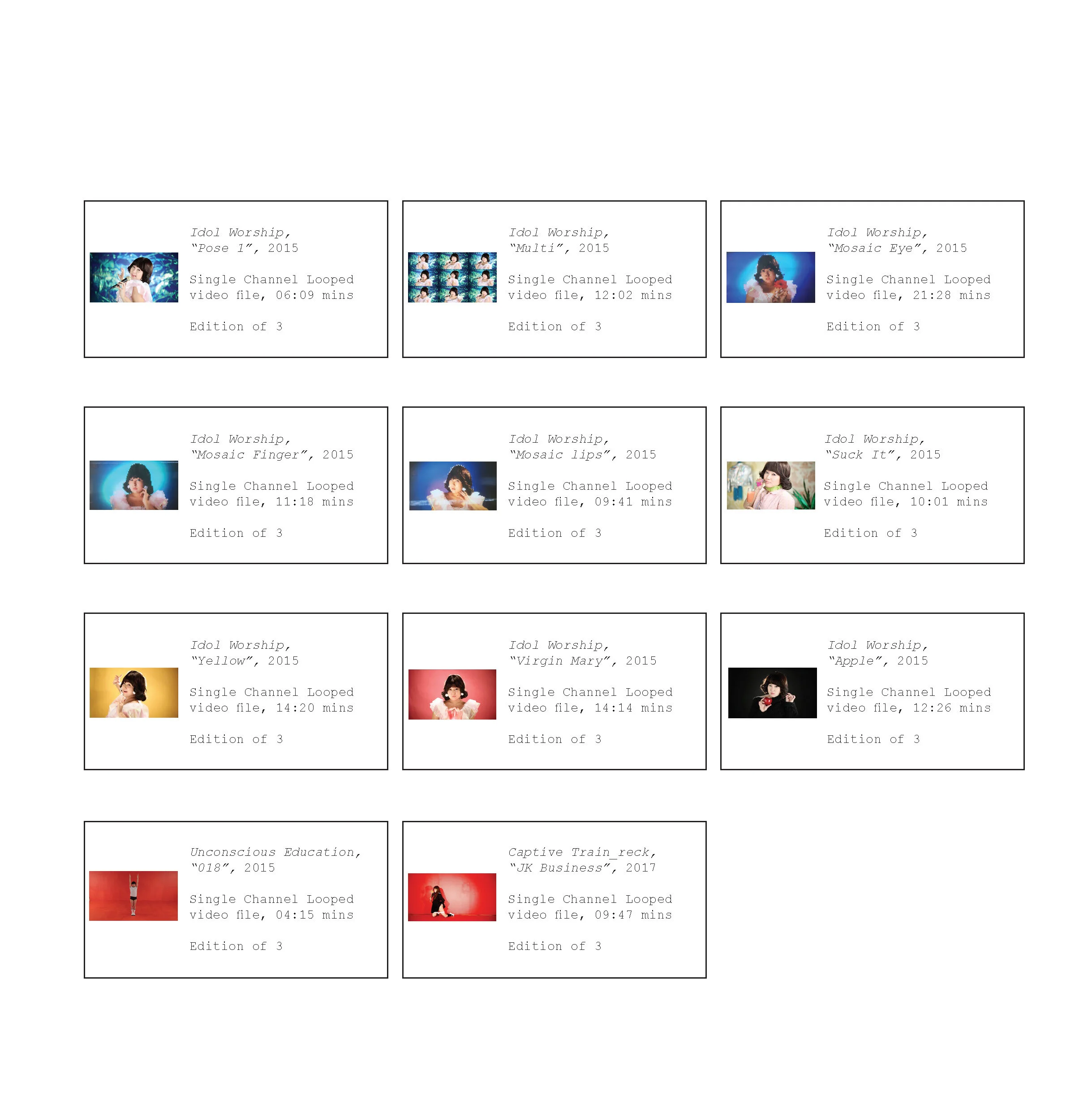
I was asked to design the book, which was to include information about the show and Saab Art Projects, a page on each artist, and details about each artwork that was available for sale. The copy was written by Saab’s copywriter, the images were sourced from our partners and the artists, and the book was designed by me.


THE DECISIONS
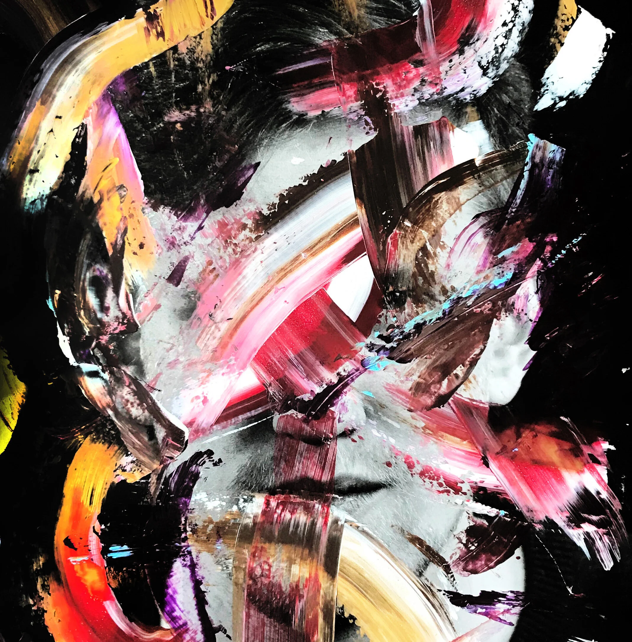
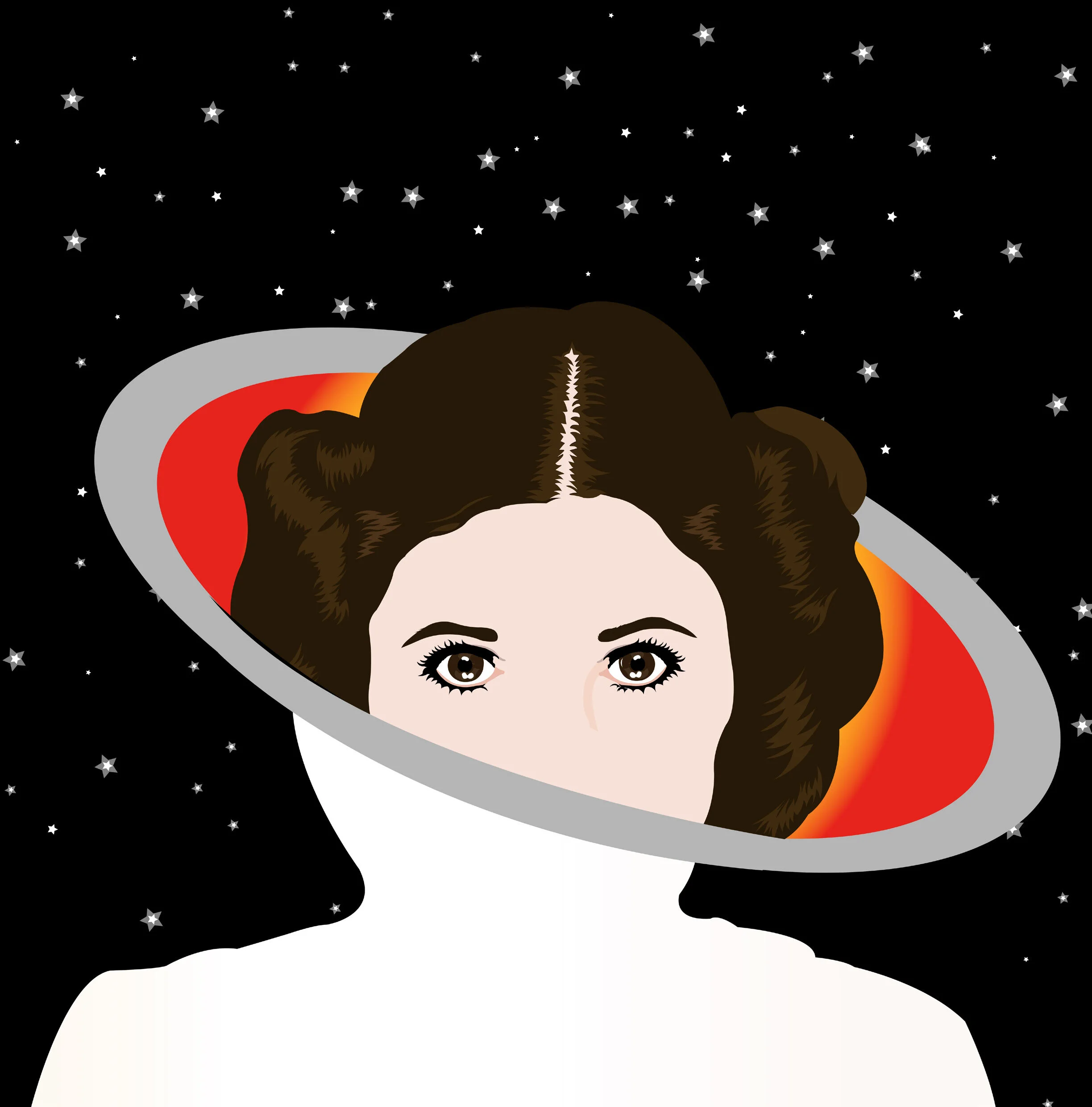
After receiving the content I needed, I began to play around with the typography, order of content and layout. I decided to put the artists in order of recognition and each page was designed with the artist's style in mind. Noritoshi’s work, for example, is known for being very clean and structured, so I tried to mimic that style for his page. By contrast, Ayakamay’s work is loud and in your face. As a result, I had her bright red artwork cover the whole spread, with the text overlaid.
I attempted to balance the book. Some pages have a lot of white space, allowing the text to carry more importance. Other pages have images covering the spread, this allows light reading to be separated by the beautiful visuals of the artists’ work. I left the background white with black text as I didn’t want the text to take away from the artworks on display.
It was important for the book to be easy to carry around: fit in a handbag, folder or backpack. So I decided upon 8” x 8”. Square formats are less typical and allowed for designing with symmetry, which I thought would be useful given that Avery Nejam and Henry Quinson (myself) had series of works that differed in colour, but not in form.
